Here are Simple steps to get started with theming for a Drupal newbee.
Steps to develop a theme with Zen as the base theme:
1. Analyse the full design which is given in template.
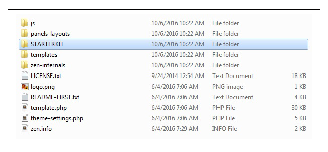
2. Unzip the zen theme, you can find the folder called “STARTERKIT”.

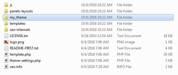
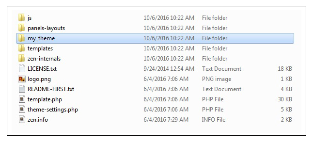
3. Rename that folder “STARTERKIT” with you theme name eg: “my_theme”.

4. This is the folder for your new theme. (Follow the instructions given by Zen theme).

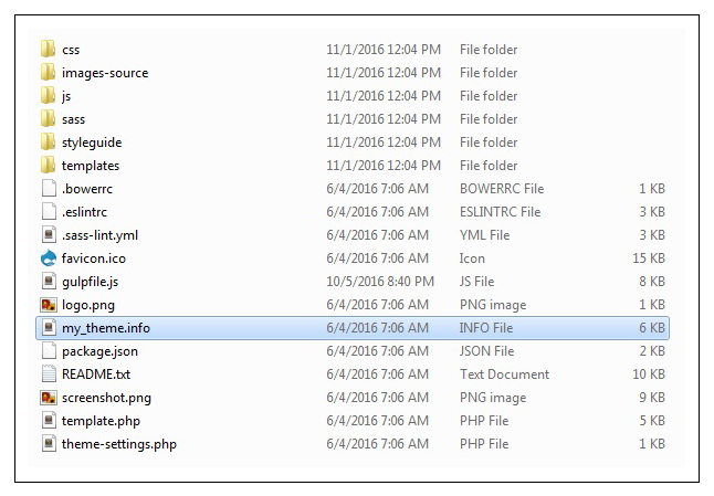
5. Rename STRATERKIT.info.txt to my_theme.info file - this provides basic information about the theme like theme version, theme core version (drupal version), Stylesheets & JS files used in the template files.

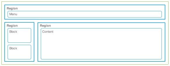
6. Understand the structure of a drupal template regions and Define the regions for your design.
7. Regions are used to place a block or content.

8. Create your regions and introduce it in the .info file first.
Sample structure of .info file
description = My Theme is my first theme for drupal 7.
screenshot = screenshot.png
// Stylesheet
stylesheets[all][] = css/styles.css
// JS
// Regions used in my_theme
regions[navigation] = Navigation bar
regions[highlighted] = Highlighted
regions[content] = Content
regions[sidebar_first] = First sidebar
regions[sidebar_second] = Second sidebar
regions[bottom] = Page bottom
regions[page_top] = Page top
regions[page_bottom] = Page bottom
8. Open the template.php and theme-settings.php file, then rename the functions with your theme name.
For ex:
function STARTERKIT_preprocess_html(&$variables, $hook) {
$variables['sample_variable'] = t('Lorem ipsum.');
// The body tag's classes are controlled by the $classes_array variable. To
// remove a class from $classes_array, use array_diff().
$variables['classes_array'] = array_diff($variables['classes_array'],
array('class-to-remove'));
function my_theme_preprocess_html(&$variables, $hook) {
$variables['sample_variable'] = t('Lorem ipsum.');
9. We can add variables for basic page elements in template.php file.
For ex:
function my_theme_preprocess_html(&$variables) {
if (drupal_get_title()) {
'title' => strip_tags(drupal_get_title()),
'name' => check_plain(variable_get('site_name', 'Drupal')),
$head_title = array('name' => check_plain(variable_get('site_name',
if (variable_get('site_slogan', '')) {
$head_title['slogan'] = filter_xss_admin(variable_get('site_slogan', ''));
$variables['head_title_array'] = $head_title;
$variables['head_title'] = implode(' | ', $head_title);
In that above example we construct the page title and assign that into the variable. Now we can use the $head_title variable throughout all the templates. In a similar manner you can create any no of variables.
10. If you need to change the template copy the files from zen base theme (Eg: page.tpl.php, node.tpl.php) and paste it into your templates folder.
For ex:
Create page.tpl.php file, it contains the code for the body of the page. You can modify that as per your requirement.
Reference links:
https://www.drupal.org/project/zen
https://www.drupal.org/node/2710573
http://johnalbin.github.io/zen-style-guide/
SASS:
What is SASS?
Sass (Syntactically Awesome StyleSheets) is an extension of CSS. Sass allows you to use things like variables, nested rules, mixins, inline imports, and more, all with a fully CSS-compatible syntax. It helps keep large stylesheets well-organized, and get small stylesheets and running quickly with the help of the Compass style library.
Key benefits of using Sass:
1. Sass provides variables as a way to store information that you want to reuse throughout your stylesheet.
For ex:
Use Variable for defining Font Face, Colours, Line height, Width - These are values used across site. Setting as variables helps us to manage change easily.
$margin-left_right-auto : 0 auto;
margin: $margin-left_right-auto;
2. Sass provides Mixins, these are like functions in php. You can declare a mixin with arguments and use it throughout the site. There are also predefined mixins for Box shadows, Font Styles.
For ex: Mixin
@mixin height-width-100 {
@include height-width-100;
@include height-width-100;
.news-slider { width: 100%; height: 100%; } .news-content {
3. In Sass @extend is one of the most useful features that allows us to share a set of CSS properties from one selector to another.
For ex:
@extend .height-width-100;
@extend .height-width-100;
.height-width-100, .news-slider, .news-content {
4. Sass @import pull the file before it compiles the CSS. Its is used to import (include) the raw CSS-file into different files. @import "path of your file";
For ex: @import 'base/fonts'; // in style.ccs
In the above example fonts will be imported to style.ccs file from the path base/fonts.
Reference links:
http://sass-lang.com/documentation/file.SASS_REFERENCE.html
http://www.webdesignerdepot.com/2014/08/5-reasons-you-should-be-using-sass-today/
https://www.sitepoint.com/sass-basics-the-mixin-directive/
Steps to have SASS working with your Drupal 7 theme
1. Let’s test if SASS is installed and compiling. Use your toolkit to compile your SASS directory or run compass watch from the command line in your theme directory.

2. You can add the styles to the .scss file. After saving your change, refresh the page and you can see the difference.
3. After saving that .scss file, compass watch command is executed automatically and it shows the modified file name.

Key tips and learning
1. Analyse full design, measure the spaces, width & height then write css.
2. Include the font, icons(i.e Font Awesome) and import the mixins,css3.
3. Write the css for mobile platform first, then using media query and alter that for tablets and desktops.
For ex:
/**
* Header
*/
.header-logo {
float: left;
max-width: 210px;
}
// For tablet and desktop
@media only screen and (min-width: 768px) {
.header-logo {
max-width: none;
}
}
In the above example, for mobile the logo width is fixed for 210px and for tablet and desktop logo width is not fixed. By this way only we can write the css.
4. In template page only one h1 is used, we can use h2,h3...h6 more than once. But only one h1 tag should be used.
5. If you use float to align the div, use clearfix code for its parent div.
For ex:
<!DOCTYPE html>
<html>
<head>
<title>My Theme</title>
<style type="text/css">
.logo-img-div {
float: left;
width: 50%;
}
.logo-slogan-div {
float: left;
width: 50%;
}
.clearfix:after {
content: " ";
visibility: hidden;
display: block;
height: 0;
clear: both;
}
</style>
</head>
<body>
<div class="header-content clearfix"> // Parent Div
<div class="logo-img"> //Child Div with float
<img src="logo.png">
</div>
<div class="logo-slogan"> //Child Div with float
<p>This is my theme</p>
</div>
</div>
</body>
</html>
6. CSS Naming Conventions is one of the most fundamental and important part of developer activities. Naming conventions help us a lot making our code more readable, predictable. And when it comes to code modification and debugging, conventions help us to easily find needed part of code.
For eg:
.is-hidden { display: none !important; }
.is-invisible { visibility: none !important; }
.block { display: block !important; }
.inline { display: inline !important; }
.inline-block { display: inline-block !important; }
.left { float: left !important; }
.right { float: right !important; }
.text-left { text-align: left !important; }
.text-center { text-align: center !important; }
.text-right { text-align: right !important; }
In above example the css class selectors are related to their properties.
// Correct way to declare the css selectors
.left {
float: left;
}
.right {
float: right;
}
// Worst way of declare the css selectors
.left-div-content {
float: left;
}
.right-div-content {
float: right;
}
7. Use the colors, fonts and images which is defined in the template you have. Create image cache for image sizes. Use Display Suite, it allows you to take full control over how your content is displayed using a drag and drop interface. We can arrange nodes, views, comments, user data etc. We can also use Panels to segregate the layout. It makes layout segregation easier.
Watch our for more of my blogs! My next blogs are going to be on Drupal 8 theming & use of Panels and Display suites!
